Forward Ever – A Charity Uniting Communities and Bridging Divides.
Forward Ever l June 2024 – Present
I’ve had the privilege of working with David Boomah, the founder of Forward Ever, and his incredible team on an exciting rebranding and social media project for their charity. This organisation is dedicated to bridging the gap between marginalised communities and key figures like police officers, social workers, and educators. The project has focused on revitalizing the organization’s logo and social media presence, adopting a fresh, friendly, and strategic approach to enhance its outreach and impact.
design approach.
My design approach with Forward Ever focuses on highlighting its strong connection to the communities it serves and its mission to foster understanding between marginalised groups and key public figures. The rebranding effort embodies this vision through carefully selected colors and shapes that symbolise the organisation’s commitment to building diverse relationships and mutual respect.
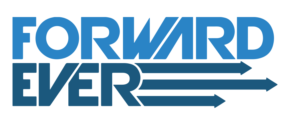
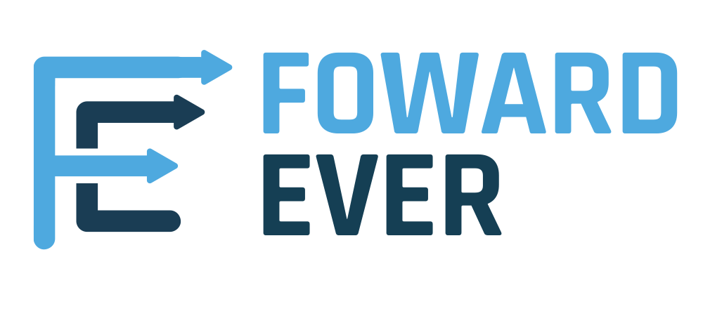
Draft #1 – This is a subtly refined version of Forward Ever’s original logo. The main challenge was that the original design felt too edgy and serious for the organisation’s mission, prompting a softer, more approachable update.
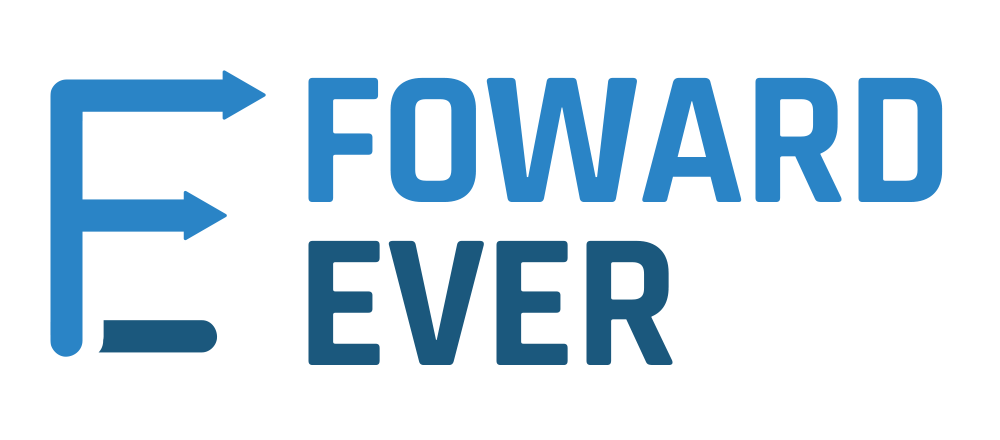
Draft #2 – The most significant change in this version is the shift from a purely typographic logo to a combination logo, integrating both text and a symbol. This approach ensures the organisation is easily recognisable.
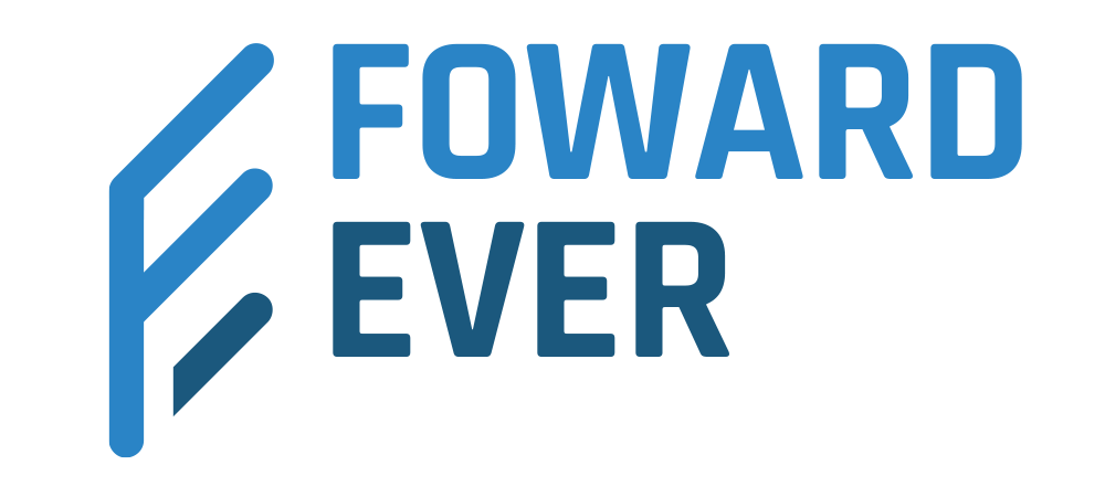
Draft #3 – This version features an updated ‘FE’ symbol that points diagonally upward to the right, symbolising the organisation’s forward-thinking approach. The ‘Forward Ever’ text is positioned beside it, creating an eye-catching 3D perspective.
Draft #4 – This draft takes inspiration from the original Forward Ever logo by incorporating three arrows shooting forward. I combined the F and E in a unique and memorable way, with arrows extending from the letter accents to emphasize forward motion.
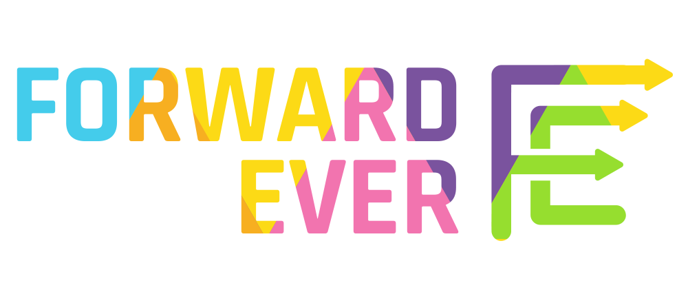
Draft #5 – I enhanced the previous logo design to address the challenge of representing the organisation’s diversity. By incorporating a spectrum of colors, I aimed to convey the sense of inclusivity and varied nature that Forward Ever strives for.
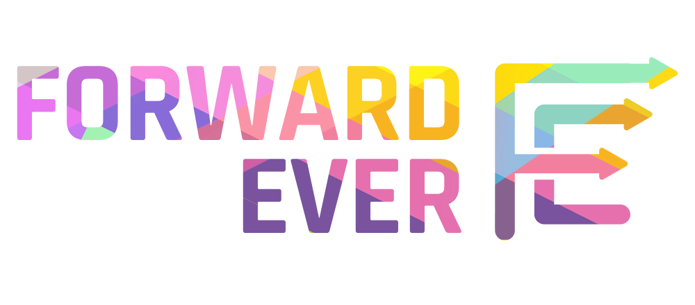
Final Design – This final version enhances the logo’s visual appeal with a diamond-like crosshatch color pattern embedded into the typography. The use of multiple shades represents diversity and inclusivity, aligning with Forward Ever’s core values.
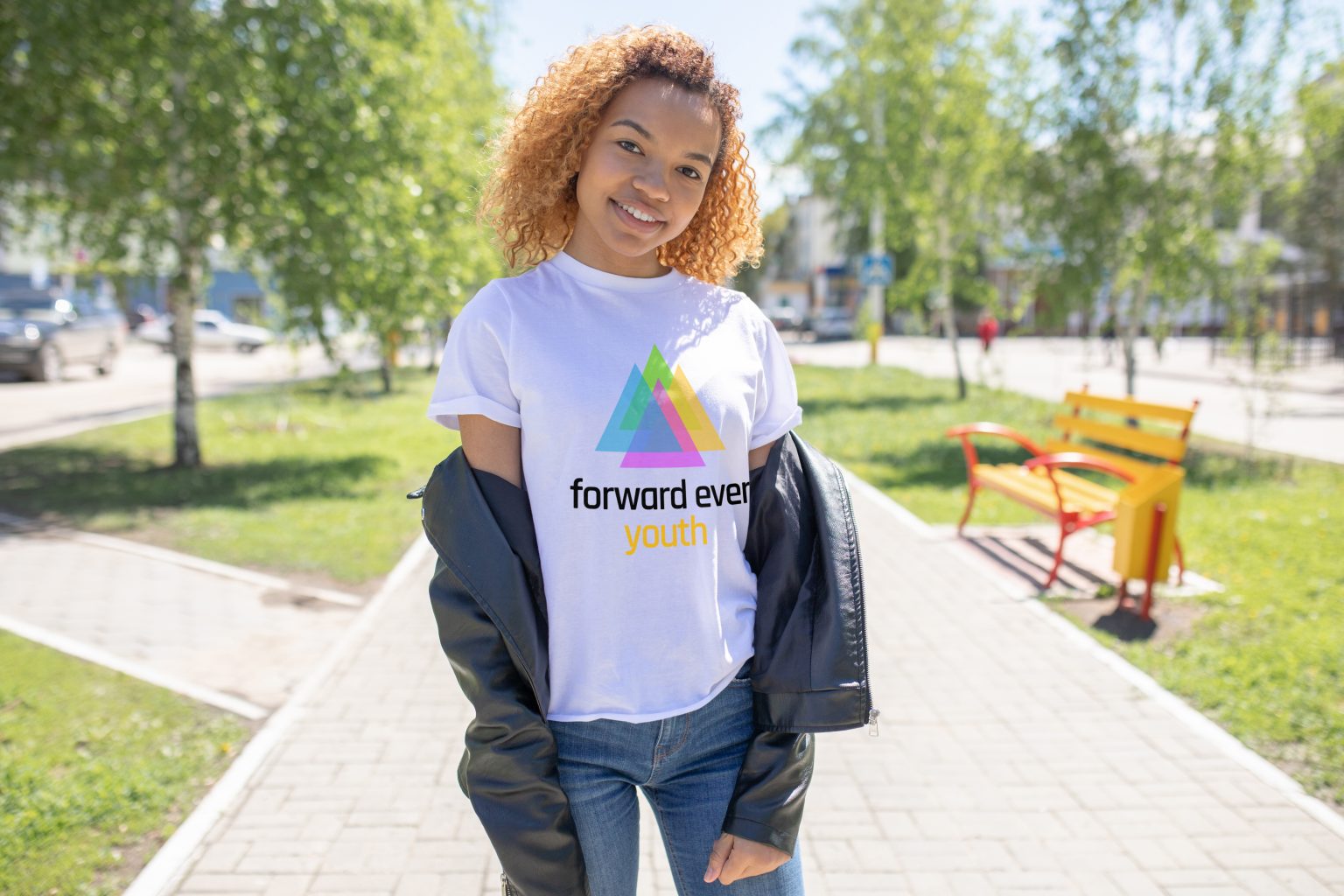
#Final Design2 – While the previous logo was effective, I opted to create a completely new design with a fresh approach. This final version emphasizes simplicity and features four triangle shapes in multiple colors, symbolising strength, motion, unity, and diversity. Complemented by a friendly, approachable, bold, and minimalist lowercase font, this logo perfectly represents Forward Ever’s values.